Display Cards define a visual representation of a record in a nicely formatted way. They are essential in xDM applications to make the user experience more intuitive and user-friendly. This article explains what is a Display Card composed of, and how display cards are used in the application.
| Note: Display cards are automatically created by the Create Application Components wizard. |
Display Cards Composition
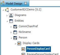
Display Cards are defined directly within each entity.
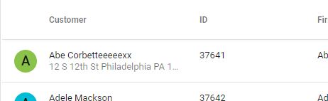
You will find 4 major elements on Display Cards :
- Primary Text Expression: main title used every time the Display Card is referenced
- Secondary Text Expression: subtitle optionally used to add some more information about the reference
- Primary Image: picture used for grids.
- Avatar: picture used in a round shape for lists.
For more information about the display card properties, please refer to the documentation.
Usages of Display Cards
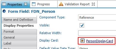
Each time you use FDN attributes for parent references, the parent Display Card's Primary Text Expression is displayed. If you want your FDN attribute to not use the default Display Card, you can define a specific one.
For example, with forms and collections:
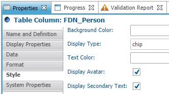
You can also choose the chip Display Type in the Style property to make the display card avatar and/or secondary text appear:
More generally, you will be able to define the display card used in the Display properties menu from each user interface element.
Please refer to the corresponding documentation: forms fields, collections, collection table columns, stepper collection steps, business entities, business views hierarchies, duplicate managers, explain records actions
Display Cards rendering samples
- In a collection
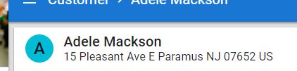
- In a form with chip Display Type, Display Avatar and Display Secondary Text checked

- In a form with Reference Display Type

- In a Transition Business View title